Mar 13, 2025
Articles
Designing a Clean Product UI with Figma and shadcn/ui

Sophia Martinez
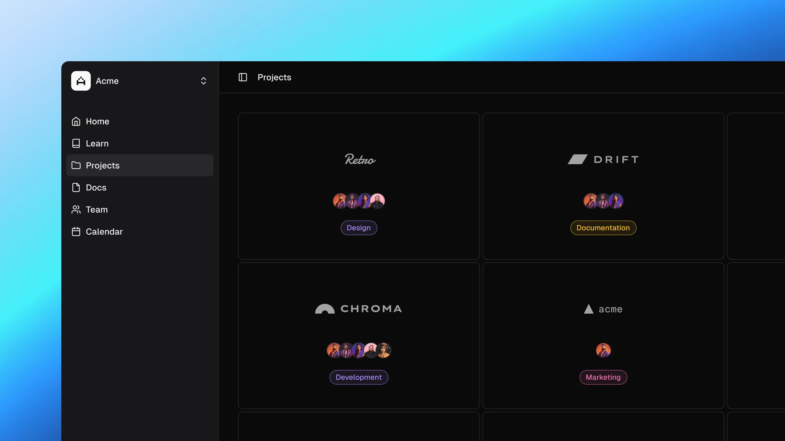
A clean and well-structured UI is essential for creating intuitive, user-friendly digital products. By combining Figma for design and shadcn/ui for development, designers can create scalable, efficient interfaces that translate seamlessly from concept to code. This article will explore best practices for designing a clean product UI using these tools and how they work together to streamline the design-to-development workflow.
1. Start with a Strong Foundation in Figma
Set Up a Design System
Before jumping into screens, establish a solid design system in Figma. This includes:
Typography: Define heading, body, and caption styles.
Color System: Use a semantic color palette that aligns with branding and accessibility.
Spacing & Grid: Maintain consistency with an 8px grid system.
Component Library: Build reusable components like buttons, inputs, and cards.
Use Auto Layout for Scalability
Auto Layout ensures your UI is flexible and adapts to different screen sizes. By using constraints and padding effectively, you can maintain consistency across all elements.
Prototype for Interactivity
Before handing designs off for development, use Figma’s interactive components to prototype key flows and animations. This helps validate usability before coding begins.
2. Bridging the Gap with shadcn/ui
Why shadcn/ui?
shadcn/ui provides a well-structured, accessible, and modern component library built with Radix UI and Tailwind CSS. It allows developers to maintain flexibility while keeping code clean and scalable.
Translating Designs into Code
Map Figma Components to shadcn/ui Components: Ensure the components designed in Figma align with available shadcn/ui elements, reducing custom development time.
Use Tailwind Tokens for Consistency: Keep typography, colors, and spacing consistent with Figma’s design tokens.
Leverage shadcn/ui's Accessibility Features: Built-in accessibility features ensure compliance with best practices.
3. Best Practices for a Clean UI
Keep It Minimal: Remove unnecessary elements and focus on usability.
Use Visual Hierarchy: Guide users with clear headings, button prominence, and spacing.
Ensure Readability: Maintain contrast and use typography effectively.
Optimize for Light & Dark Mode: Consider both themes for accessibility and flexibility.
4. Streamline the Handoff Process
Use Figma Annotations: Clearly document interactions and design choices.
Provide Code References: Include shadcn/ui documentation links to guide developers.
Test & Iterate: Gather feedback early from developers and refine accordingly.
Conclusion
Using Figma for design and shadcn/ui for development allows for an efficient, scalable approach to building clean product UIs. By following structured workflows and best practices, designers can create beautiful, functional interfaces that seamlessly transition into code. 🚀