Mar 13, 2025
Interviews
Why Using Components Will Save You Time and Effort

Liam Wong
In modern UI/UX design and development, efficiency is key. Whether you're designing in Figma or building in code, using components can drastically improve your workflow. Instead of creating elements from scratch every time, components help you maintain consistency, reduce redundancy, and speed up the iteration process.
In this article, we'll explore the benefits of using components, how they work in both design and development, and best practices for integrating them into your workflow.
1. What Are Components?
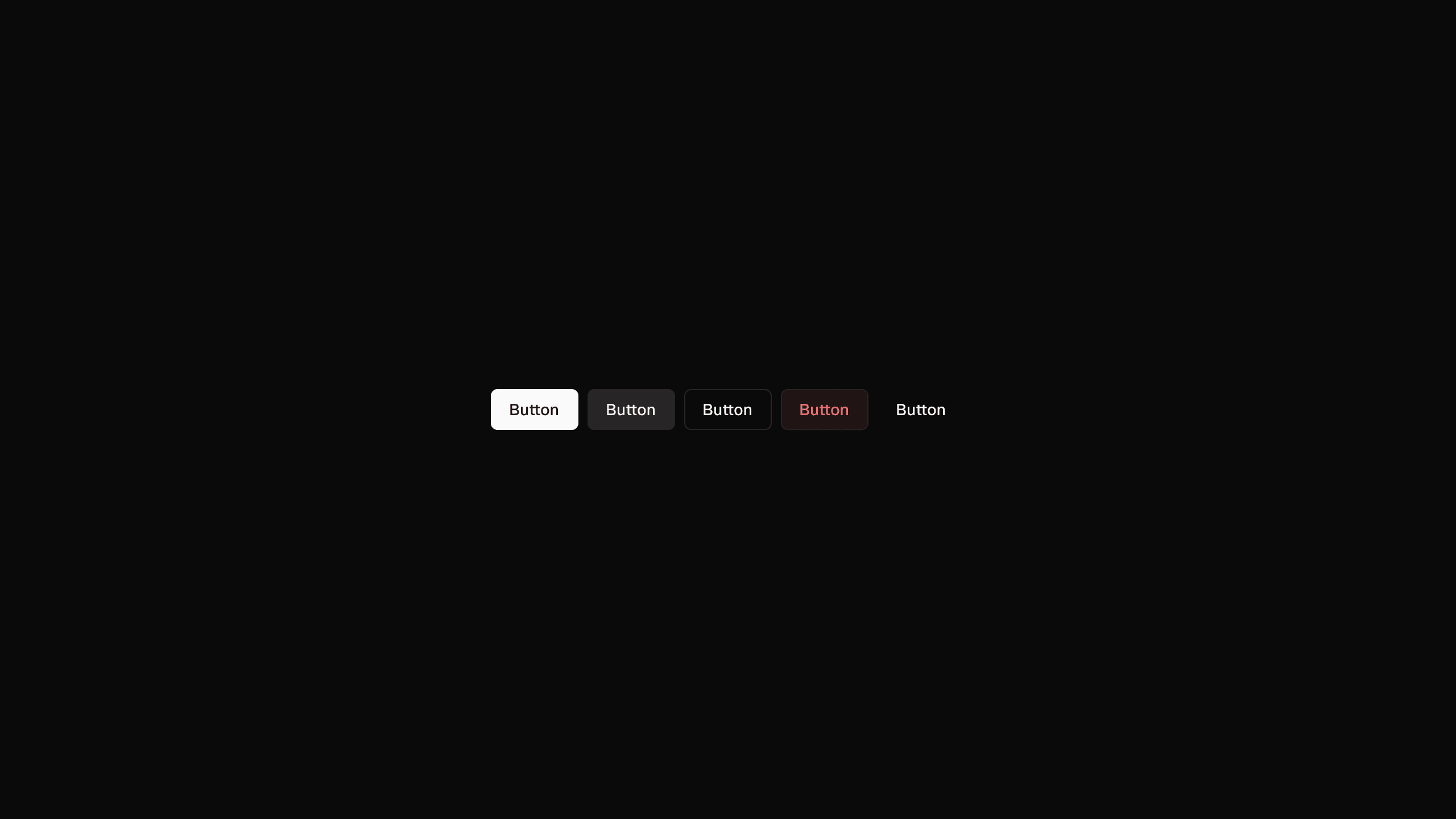
A component is a reusable design or code element that can be used multiple times across a project. Examples include buttons, input fields, cards, modals, and navigation bars.
How Components Work in Design & Development:
In Figma: Components allow designers to create master elements that can be reused and updated globally.
In Code (React, shadcn/ui, Tailwind): Components ensure consistency by defining reusable UI elements in a modular fashion.
2. Benefits of Using Components
1. Saves Time and Effort
Instead of redesigning or recoding the same elements, you reuse them instantly.
Global updates mean changes to a single component reflect across all instances.
2. Ensures Consistency
Prevents inconsistencies in spacing, typography, and colors.
Keeps the brand identity and UI elements uniform across all screens.
3. Simplifies Maintenance and Scalability
Need to update a button style? Modify it once and apply changes everywhere.
Makes it easier to scale a product without redesigning every element manually.
4. Improves Collaboration Between Designers and Developers
Designers define components in Figma → Developers build them in code.
Reduces miscommunication by keeping components aligned between design and development.
3. How to Effectively Use Components
1. Build a Component Library
Establish a core set of reusable components for buttons, forms, modals, and typography.
Document how and when to use each component.
2. Utilize Variants and Properties
In Figma, use variants (e.g., different button states like primary, secondary, disabled).
In React/shadcn.ui, define component props to make elements customizable without rewriting them.
3. Organize Components in a Design System
Group components in categories (e.g., Forms, Navigation, Alerts).
Store design components in Figma libraries for easy access.
Store code components in a shared UI repo (e.g., a component library in shadcn/ui or Tailwind).
4. Test and Iterate
Regularly update and refine components based on feedback and evolving needs.
Ensure components remain accessible and responsive.
4. Conclusion: Work Smarter with Components
Using components is not just about saving time—it’s about working smarter. They bring efficiency, consistency, and scalability to both design and development, making it easier to maintain and grow digital products.
By investing in a component-based workflow, you set up a strong foundation that allows for faster iteration, easier updates, and a smoother collaboration process between designers and developers. 🚀
Are you ready to streamline your workflow? Start building with components today!
In modern UI/UX design and development, efficiency is key. Whether you're designing in Figma or building in code, using components can drastically improve your workflow. Instead of creating elements from scratch every time, components help you maintain consistency, reduce redundancy, and speed up the iteration process.
In this article, we'll explore the benefits of using components, how they work in both design and development, and best practices for integrating them into your workflow.
1. What Are Components?
A component is a reusable design or code element that can be used multiple times across a project. Examples include buttons, input fields, cards, modals, and navigation bars.
How Components Work in Design & Development:
In Figma: Components allow designers to create master elements that can be reused and updated globally.
In Code (React, shadcn/ui, Tailwind): Components ensure consistency by defining reusable UI elements in a modular fashion.
2. Benefits of Using Components
1. Saves Time and Effort
Instead of redesigning or recoding the same elements, you reuse them instantly.
Global updates mean changes to a single component reflect across all instances.
2. Ensures Consistency
Prevents inconsistencies in spacing, typography, and colors.
Keeps the brand identity and UI elements uniform across all screens.
3. Simplifies Maintenance and Scalability
Need to update a button style? Modify it once and apply changes everywhere.
Makes it easier to scale a product without redesigning every element manually.
4. Improves Collaboration Between Designers and Developers
Designers define components in Figma → Developers build them in code.
Reduces miscommunication by keeping components aligned between design and development.
3. How to Effectively Use Components
1. Build a Component Library
Establish a core set of reusable components for buttons, forms, modals, and typography.
Document how and when to use each component.
2. Utilize Variants and Properties
In Figma, use variants (e.g., different button states like primary, secondary, disabled).
In React/shadcn.ui, define component props to make elements customizable without rewriting them.
3. Organize Components in a Design System
Group components in categories (e.g., Forms, Navigation, Alerts).
Store design components in Figma libraries for easy access.
Store code components in a shared UI repo (e.g., a component library in shadcn/ui or Tailwind).
4. Test and Iterate
Regularly update and refine components based on feedback and evolving needs.
Ensure components remain accessible and responsive.
4. Conclusion: Work Smarter with Components
Using components is not just about saving time—it’s about working smarter. They bring efficiency, consistency, and scalability to both design and development, making it easier to maintain and grow digital products.
By investing in a component-based workflow, you set up a strong foundation that allows for faster iteration, easier updates, and a smoother collaboration process between designers and developers. 🚀
Are you ready to streamline your workflow? Start building with components today!